Jun 05

COMMENTS


“Facebook

Image taken from Mashable


Facebook Pages are getting a redesign, yet again. The timeline on Facebook pages will now be a single column, much similar to the look of your general news feed on Facebook.

This redesign comes rather close to the Twitter redesign that has been flooding profiles within the past couple months. The new Twitter design also features a single column feed, with larger text/images.

The Facebook Pages Timeline now has a simpler design, less grid like and as Mashable states, “blurs the line between a personal account and a Pages account, which makes sense” (Mashable).

The new design also allows users to move sections around, being open to customization. And remember those nice little Custom Tab designs you had at the bottom of your cover photo? They’ve now moved to the left sidebar, which adds to the simple, more stripped down design that Facebook seems to be pushing towards.

What do you think? Is the grid like style or single column the way to go? Does it make a difference for Facebook? Let us know in the comments below!

Read More… Post Comment
Apr 23

COMMENTS


“Twitter

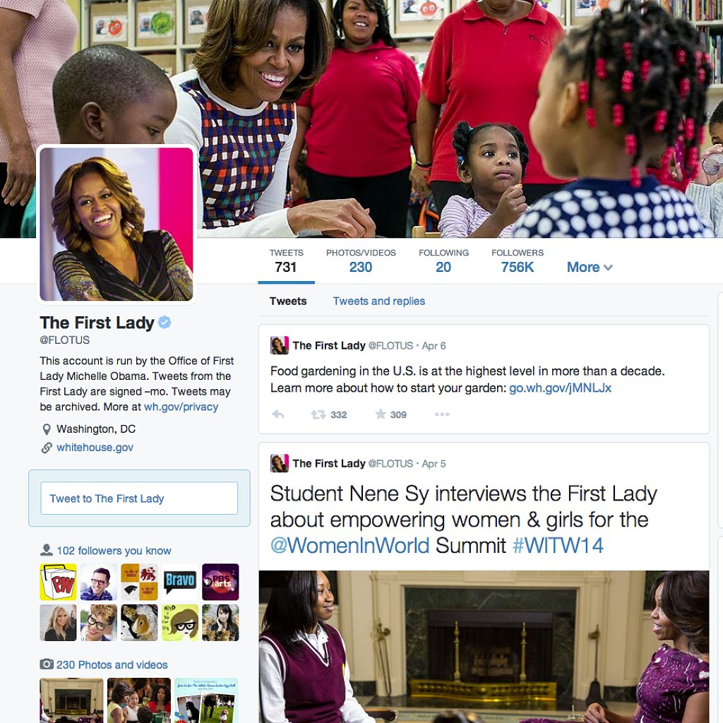
Yesterday, all Twitter users gained access to their new web profile. The ability to personalize profiles, much like recent Facebook updates, is allowing for an increased creative and multi-media experience on this platform.

What’s new? Larger photos and profile headers are featured at the top of the page. Best Tweets, those more popular amongst followers, will appear larger in font size to promote positive reception. Pinned Tweets allow you to place your favorite Tweet at the top of your profile. Filtered Tweets are used while browsing, and you can choose to view Tweets alone, with photos or videos, or with replies. Also, the new “Following” list has boards of profiles with header photos and descriptions that resemble Pinterest formatting.

Overall, the new format makes editing and managing profiles more intuitive. Bigger photos and fonts are an effort to make Twitter more accessible and personalized in real time. The new twitter, the new you: check it out here.

Read More… Post Comment

May 28

COMMENTS


Flickr rolled out some new features and a hot new design that offers higher resolution, a news feed, and more.

Landing on the home page, you’ll already notice the brand new design, bigger images, and crisper resolutions. Flickr is giving all its users 1 terabyte (yes terabyte) of space. This makes way for bigger and better images.

flickr3

flickr1

flickr2

Mashable explains that the “news feed” feature is a bit similar to the Instagram news feed. To see this feature in full, check out their video that takes you through the new Flickr here.

Sharing is now also easier on Flickr. Once you post, you can easily share to Facebook. Twitter, Tumblr and more.

Overall, the new design is much more progressive in the digital/social media realm and the endless amount of space and higher resolutions are sure to make all Flickr users happy.

Read More… Post Comment

Subscribe

Categories

Archives

2016
2015
2014
2013
2012
2011
2010
2009

Authors

elder
elder