Oniracom’s new identity revision is not a radical change from its previous incarnation, but it’s more revised and organized than at any point in our 15-year history. After such long a stretch of time, something has to change or complacency creeps in, threatening future creativity. As we pivot to specific offerings for a select clientele, our identity will reflect that.
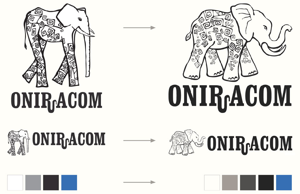
Our elephant mascot has become more active and assertive, charging ahead to the next opportunity—but like all elephants it hasn’t forgotten who it is, where it came from or what makes it great and powerful.
Our revised colors keep it real, moving from plain black and white (which never occur in nature) to a more subtle palette of ivory, charcoal, and shades of gray or blue. Their use changes too, becoming more subtle and allowing our work to speak for itself unencumbered by interfering identity.
One thing that won’t change, though, is our wordmark. The customized “Oniracom” in Clarendon Condensed Bold is a visual link to our identity’s legacy—because we’re not forgetting the past. We’re simply defining our own future, and we’d love for you to join us there!